
Responsiveness
Ensuring content is equal across browsers and devices.
Making a site responsive
Sites should be adequately responsive and equally viewable on any device. Sites should be compatible with current browsers on Mac (Safari, Firefox, Chrome) and Windows (Microsoft Edge, Firefox, Chrome).
If a site cannot be made properly responsive and compatible with all browsers and/or devices, include a message to alert users of the non-responsive design elements. Prompt the user with the option to continue to the rich version with a warning that it may not function as intended or direct them to a simplified access of the content in an HTML version.
Responsive websites will automatically resize to look good on all devices including tablets, phones, and desktops. Test a site across devices or use Chrome Developer tools. By opening the tools and choosing the Device Toolbar (with the screen/device icon), pages can be tested with various responsive viewports. This allows various screen sizes and types of mobile devices to be tested.

Desktop version (on a laptop) of Navigating the St. Lawrence

Mobile version (on a phone) of Navigating the St. Lawrence
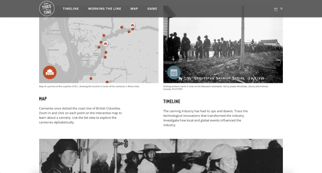
Desktop version (on a laptop) of From Tide to Tins

Mobile version (on a phone) of From Tide to Tins
What to check
- Check the layout by clicking on various break points and on specific types of mobile devices.
- Remember to check in landscape mode by rotating the viewport.
- Ensure that design and content are shown in the same order with no large gaps between content sections.
- If some content is intentionally unavailable on mobile devices, give users a warning that some content will be unavailable and allow them to view the site in desktop mode.