
Text
Maintaining structure and visual representation of text.
Headings
Visual headings divide sections of information and need to be marked up in order for users using only a keyboard or screen reader to be able to navigate. Headings should have a meaningful and clearly outlined hierarchy.
What to check
- Each page should have at least one level one (h1) heading.
- All text that looks like a heading is marked up as a heading.
- The heading hierarchy is meaningful, beginning with an <h1> tag (generally similar to the page title) and does not skip levels.
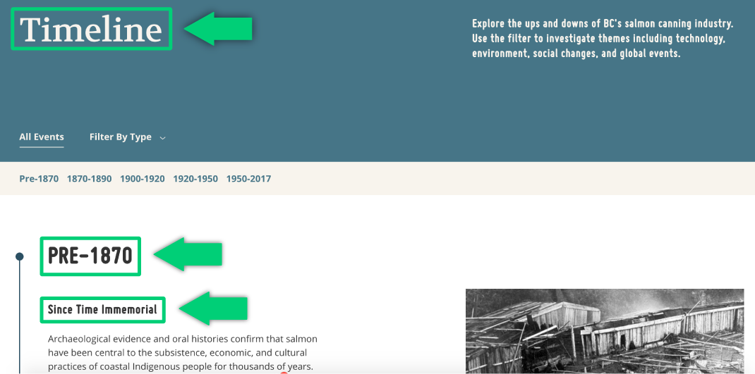
Highlighting From Tides to Tins headings with the appropriate markup (“Timeline” is marked up as h1, “Pre-1870” is marked up as h2, and “Since Time Immemorial” is marked up as h3).
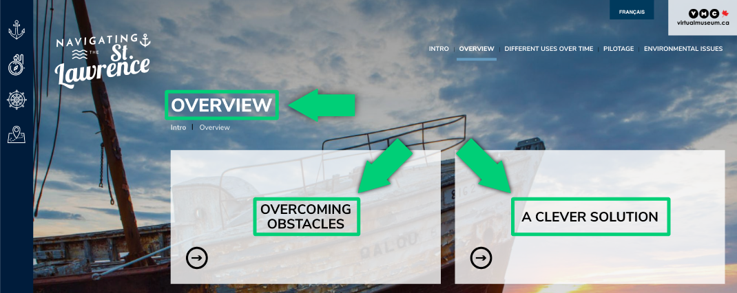
Navigating the St. Lawrence headings with appropriate markup (“Overview” is marked up as h1, “Overcoming Obstacles” and “A Clever Solution” are marked up as h2).
Resources
- Easy Checks – A First Review of Web Accessibility: Headings
- Chrome Extension headingsMap
- Chrome Extension Accessibility Insights for Web
Resize
Some users need to enlarge web content or alter other aspects of the display including font and line spacing in order to read it clearly. Most browsers allow users to change the text size through settings, text-only zoom, or page zoom. If the page was not designed properly these alterations might render the page unusable; columns and sections could overlap, line spacing could reduce, and text could disappear.
Long lines of text make for poor legibility. WCAG 2.0 recommends a width of no more than 80 characters.
What to check
- Text can be made larger. It is best to avoid images containing text; they are unreadable by screen readers and difficult to resize.
- Text doesn’t disappear or get cut off when it is made larger.
- Text, images, and other content does not overlap when made larger.
- All buttons, form fields, and other controls continue to be visible and usable when made larger.
- Horizontal scrolling is not required to read the full line of text.
- It is best practice to make sure all text is visible on the screen with only vertical scrolling required. Set the text to “wrap” and fit the screen size when the size is increased.


Example of good and problematic text resize. The letters in the image below are overlapping.
Resources
- Easy Checks – A First Review of Web Accessibility: Resize
- Quick Test: Resize Text
- Readability: The Optimal Line Length
Contrast
Some users cannot read text without a high contrast between the background and text colours, or without low luminance on the page if the colours are too bright. Accessible web browsers should allow users to change the colours of the text and background while still functioning.
The minimum contrast ratio is 4.5:1 for normal-size text (12px). For larger text (at least 24px and normal weight, or 19px and bold) the contrast ratio must be at least 3:1.
What to check
- Ensure any text on a light background is a dark colour and any text on a dark background is a light colour.


Example of navigation with good contrast (image above is 4.6:1) and inconsistent contrast (image below goes below 4.5:1 in certain areas).
Resources
- Easy Checks – A First Review of Web Accessibility: Contrast Ratio (“colour contrast”)
- Contrast Checker
- Contrast Checker by Acart Communications