
Colour
Presenting functionality with alternatives to colour.
Colour
Colour is an important design element; however, accessibility can be compromised if perception of the content is based entirely on seeing or understanding the colour.
In order to make a site accessible there should be no instructions, information, or navigation tools that rely on solely on colour to convey information.
What to check
- Links should be easily identifiable without the use of colour. The clearest way to signify links is with underlining.
- Required fields and fields with errors must include non-colour ways of identification.
- When the colour of words, backgrounds, or other content conveys information, also include this information in the text.

Outlining/highlighting From Tides to Tins website main navigation which is underlined
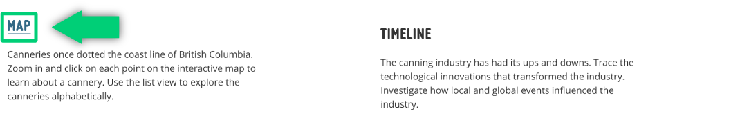
Outlining/highlighting map navigation on From Tides to Tins website as it becomes blue and underlined when selected.
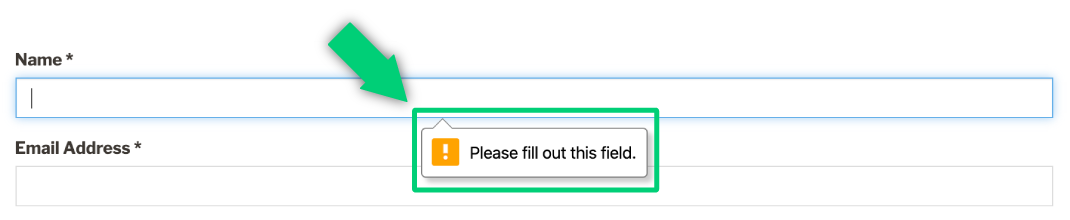
Submission error notification on form from the Canadian Photography Institute’s Photostories website .